Tampilkan postingan dengan label Design. Tampilkan semua postingan

Jumat, 04 Januari 2013

Winstanley and Goliath

Q and A with Michael Winstanley
by Beth Herman

Creating his own office space for a burgeoning staff at 107 N. West Street in Old Town, Alexandria, along with a state-of-the-art photography studio for wife Jessica Marcotte under the same roof, Michael Winstanley of Michael Winstanley Architects and Planners slayed the giant. Pitting the $490,000 design against Goliath projects by other firms, including a $50 million Columbia University biology lab, the 4,350 s.f. Winstanley office won 2011's National Society of American Registered Architects (NSARA) Award for building design. In the same year it also garnered a National Association for Industrial and Office Parks (NAIOP) Award for building renovation. DCMud spoke with Winstanley about the little office that could.

DCMud: Your firm is renovating Union Station and has designed large-scale structures in faraway places like Macau and Kazakhstan. How did you choose a building to reflect the range of your work?

Winstanley: We were originally in another old building in Old Town which was sold and was to be torn down. Jessica and I had about 1,000 s.f. each, and I had four employees. My practice was growing, and my wife needs a 12-foot high space for her photo stand and light booms. In Alexandria there isn't a lot of warehouse or industrial space, so it took a long time to find but we finally located it - a former carpet warehouse. Financing was done through a combination of private funds along with SBA and bank loans.

DCMud: What were some of the design challenges you faced?

Winstanley: Our building sits on the property line so that's as much land as we had: a zero lot line. We had a tight budget and no windows except for clerestories, and needed to have some vision windows, so we put windows along the alley which is really a fire lane - the only place we could have them. Because we work late, our office looks out onto the alley so it no longer feels unsafe for the neighborhood. We also used four operable skylights on the opposite side of the building to balance the light inside, which washed the walls in daylight.

DCMud: Sounds as though you had an eye to sustainability.

Winstanley: In fact during the day you don't even need the lights on. We also did operable windows to open for fresh air as often as possible. The entire concrete block envelope is now heavily insulated (there was none at acquisition): floor; roof; walls. The HVAC system is automated so it's off at night. For flooring we used reclaimed oak from Virginia, and it's raised up on sleepers to run our data cables underneath it to avoid data drops from the ceiling. Finally, though the building was marketed as a tear down and rebuild, we chose to use the existing building instead of razing and starting over. We are also five blocks from the King Street Metro.


DCMud: We understand the IKEA workstations have their own little backstory.

Winstanley: We currently have 20 workstations in 3,350 s.f. (the remaining 1,000 s.f. is allocated to the photography studio) but can comfortably seat 25 to 30 employees when necessary. I knew that IKEA was an economical solution but had always thought it looked too inexpensive given the kind of work we do. My concern was that IKEA furniture would indicate a modest practice, when we actually do a lot of large scale projects - like a $300 million, one million s.f. development in San Antonio. I looked everywhere for something else but never found anything with the right feel.

DCMud: So you acquiesced?

Winstanley: I wanted to do something that didn't scream IKEA, but using the same we designed a very simple four-piece furniture system. The colors and textures matched the office. The irony is when I went to add a few more desks later on, IKEA had stopped making some of the components. A carpenter agreed to replicate things for $400 - for just one of the tabletops - when it had cost $80 at IKEA. But we had to do it!

DCMud: The conference room seems to be open to the rest of the space. How does that work acoustically?

Winstanley: It's far enough away so that meetings don't interfere. We also have an in house model making shop in our space.

DCMud: Tell us about the photography studio.

Winstanley: It's all open with its own entrance. Jessie has (dedicated) office space with her desk and couch within the studio. There's also an IKEA kitchenette, just like we have in the architecture studio.


DCMud: Given the breadth and scope of your work, why are you based in Old Town and not D.C.?

Winstanley: We're planners as well as architects and I've lived in a lot of cities, including Boston. Old Town reminds me of Beacon Hill which I like. In D.C., however, you surely can't escape the power of the L'Enfant plan: the organization of the city; the symbolism of the capitol; the location of important public buildings in the Federal Triangle. It's a green and livable city that appeals to me because Charles L'Enfant was smart about the way it was planned and organized. D.C. is unlike any other place.

Photos courtesy of Jessica Marcotte

Sabtu, 29 Desember 2012

Eat Stay Love: LEBANESE TAVERNA

Q and A with Francisco Beltran and Angel Betancourt
by Beth Herman


Very much a family affair, the revered late 1980's-era Woodley Park Lebanese Taverna, 2641 Connecticut Avenue NW, is one of six restaurants, four cafe's and a market in the industrious Abi-Najm kin's epicurean gallery. Undergoing a complete demolition, Principal Francisco Beltran of Design Republica and project manager Angel Betancourt of Potomac Construction Services reimagined the 165-seat, 4,300 s.f. space. DCMud spoke with Beltran - veteran of more than 100 restaurant designs - and Betancourt about the venue, which reopened in early November.

DCMud: From a general perspective, what did the renovation entail?

Betancourt: It was a total demolition resulting in a more open feeling and contemporary design.

DCMud: Did anything survive the former design?

Betancourt: We did retain the cross-vaulted ceiling, though removed a lot of beams so the ceiling looks higher.

Beltran: The cross-vaults were something the family had invented back in '88, and that became the heart and soul of the restaurant. However previously, they'd had bulkheads that concealed air ducts and crossed the dining room horizontally that connected at points of the cross-vault. When we removed them, the illusion of a much grander ceiling, though it was already at 15.5 feet, was created. Removing the bulkheads gave a lot of verticality to the space as it's very linear and narrow.

DCMud:Was the space reconfigured in any way, and if so for what purposes?

Beltran: The restaurant had taken over an adjacent space in the mid-90s, making it into the private dining room - but it had no connection to the front of the house and people felt they were not dining in the heart of the restaurant. In the new design that space became the kitchen, and the new private dining room was conceived as a part of the main dining room.


DCMud: There appears to be a lot of sumptuous custom mill and tilework.

Beltran: The way we chose to finish the walls, floor surfaces and more was based on the Lebanese tradition of using hardwoods like walnut, much of which is reclaimed wood.Tabletops throughout are reclaimed walnut.

The main floor is assimilated wood plank flooring that's made of porcelain. It provides the illusion of warm hardwoods but is much more durable and non-slip. Custom concrete tile was used on the bar faces, and will be used on the storefront facade later on.

Carpet tiles in the restaurant are recyclable and have an oversized print and more of an antique look, which gave a warmth and character to the main dining room.

DCMud:  The private dining room appears to be swaddled, if you will, for luxury and sound.

Beltran: In that space, we used a floor-to-ceiling striping pattern where we alternated walnut hardwood planks in between 18-inch wide fabric panels, actually Homasote boards with batting, for dimension. We wrapped green tea leaf velvet fabric. All three major walls are encased in wood and velvet panels.

In the other part of the restaurant, we used copper velvet fabric for the banquettes treated with Nanotech stainguarding.

DCMud: Can you speak to the lighting?

Beltran: All lighting is LED. Chandeliers were custom made in Egypt specifically for this project. The chandeliers in the wall that divide the private dining room from the main dining room are Moroccan lanterns that we find in most Lebanese Taverna restaurants.

DCMud: Does the new restaurant resemble any of the others?

Beltran: From the time I first starting working with the family, in 2000, it was clear they didn't want their spaces to look like anything cookie-cutter, or a franchise. Each restaurant is specifically designed and detailed within the community - each has a different look and feel. And it's always a team effort, as the family, chefs and staff are deeply involved. The food, service and friendliness may be the same, but the experience of the surroundings is completely different. And the family treats each restaurant like it's their only one.

DCMud: More like Louis Sullivan's contextual architecture, perhaps.

Beltran: Each speaks the language of its community or neighborhood.

DCMud: You began working for family in the restaurant business when you were 14 years old, something that evolved to later experiences with renowned chefs/restauranteurs Victorio Testa, Roberto Donna and others. Is your hospitality design work a strategic outcome of this?

Beltran: I knew in junior high school I wanted to be an architect. Combining food and design was more of a coincidence, though, when the first architecture firm at which I worked  did a restaurant. I said, 'I know all this,' so it was a natural blending and I never looked back.

DCMud: Is there a particular D.C. building that has impacted you as an architect?

Beltran: It has to be the Holocaust Museum. It's not so much the displays but the actual path through the building - the lighting. It's the way the walls enclose and direct you to experience the space - something very successful, very powerful and moving. I try and do that with my restaurants. I want to tell a story and give a different experience in any point of the restaurant - not just have it be one big open space where you see everything and know what it is. If you sit in different areas, they should evoke different feelings and emotions.

Kamis, 20 Desember 2012

Thoreau Slept Here

by Beth Herman   


In his quest for an unembellished life, transcendentalist Henry David Thoreau took to the woods with perhaps a not-so-novel battle cry. "Our life is frittered away by detail," he famously wrote. "Simplify. Simplify."

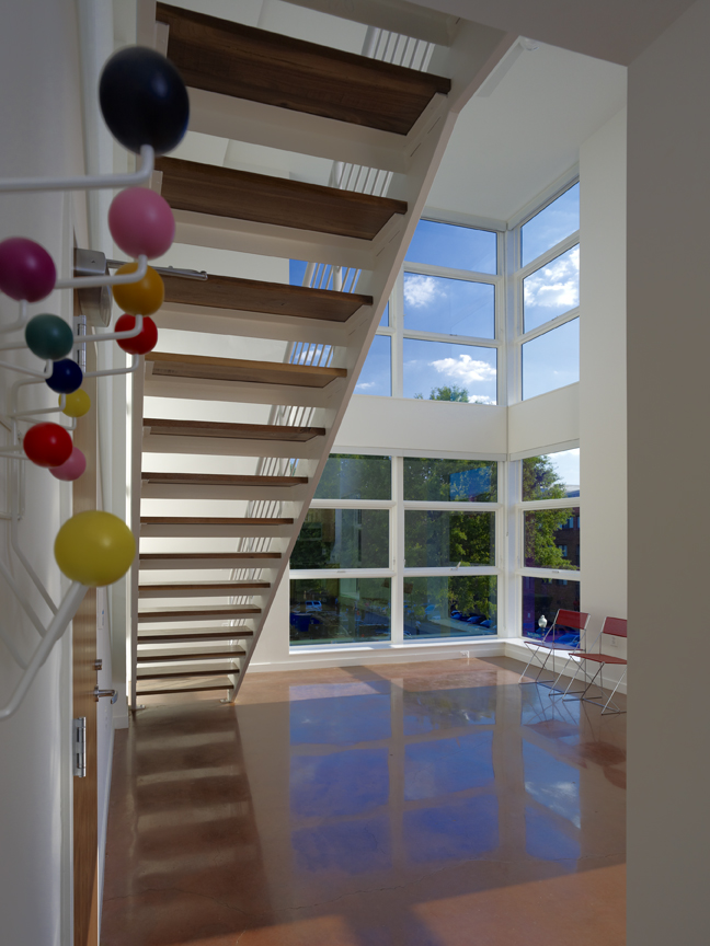
In their pursuit of a renovation and addition to a 1950s modern house that would reflect a Thoreau-esque aesthetic, and also court the abundance of mature trees around their Arlington, Virginia property, homeowners Jed and Marie joined forces with award-winning architect Patrick Carter of Reve Design Studio to achieve their goal.

'The client had a 1 1/2-story house with a master suite, kitchen and living room on the first floor and a tiny hallway with two secondary bedrooms on the second," Carter said of the 1,666 s.f. residence. "It was an open floorplan and though not really a formal space, there were no informal places for the kids to play." At certain times of the year, it also provided a view of the D.C. skyline.

Parents of two young children, Jed grew up in a modern Michigan home designed and built by an architect father. Marie is a card-carrying minimalist, according to Carter, and creating a modern-minimalist residence for a growing family that tipped its hat (or roof slope) to nature was a tall architectural order.

With a program to keep the master on the first floor and add 549 s.f. by reconfiguring the upstairs to maintain the two children's bedrooms, but add a family room, home office/music room (the family plays multiple instruments), and also retain a portion of the roof deck as a second floor balcony, Carter reached out to Mike Madden and John Page of Madden Corporation (construction) and Andrew Greene of Potomac Woodwork. A prodigious use of custom millwork came to define the new space, including a strong display of sandblasted rift-cut oak door panels between the family room and office/music room.

"Sandblasting eats away at the soft grain and leaves a physical texture - not just a visual one," Carter explained. The result of a "tricky" treatment in the drywall, when the closet doors are closed there are five equal segments: two wood and three wall.

With the design driven largely by Marie's need to compartmentalize and eliminate clutter, the house, which had virtually no storage, received a series of ample closets with double doors in the new space. Keeping the rooms open, furnishings are sleek and spare, including designs by LeCorbussier, Marcel Bruer and Charles and Ray Eames. And because you're up in the trees, Carter explained, keeping a clean color palette was imperative to draw attention out to the home's exterior. To that end white oak flooring, originally found on the first level, is carried through upstairs, along with pristine white walls and ceiling.


Room with a view
"Because the house is on a hill in the woods, and there's no yard, having a way to be outside was important. We wanted to keep that outdoor space on the second floor," Carter said of the now Ipe-decked balcony with tongue-in-groove cedar ceiling, citing the tree house effect as a key design component. Double-paned, low-E floor-to-ceiling windows, operable at the bottom and at full length on the ends, give the effect of "stepping out into the trees," as does the bay that cantilevers out, extending beyond the building's main box envelope.

With Jed an Air Force Academy graduate, the idea to represent the roof line as an inverted wing also provided the opportunity for a Frank Lloyd Wright Prairie-style moment inside the home. As the roof butterflies with the low point at the center of the house, the occupants' experience of the space is compressed, beginning with the 8-foot. ceiling height, and then swept up and out through the expansive glass, where the ceiling is 10 feet.

On the exterior, bronze accents and siding in muted green tones - specifically Benjamin Moore Nantucket Gray and Celery Salt - harmonize with the surrounding Evergreens and other arbors. Carter worked to preserve the existing 1950s brick and matched its natural-hued mortar with the exterior paint choices so not to create additional maintenance issues for the homeowners.

Cable rails, creating an open and closed railing system, were a device to open up the outdoor space as much as possible. Though the house is in the woods, there are neighbors on either side and across the street. "It was a balance of privacy and openness, of taking advantage of the views and still allowing privacy if you're out on the deck," Carter explained.

Showing you the door


Recalling that the first time he went to the Arlington house a solid wall atop a brick wall prevented him from finding the front door, opening the front to engage the street was paramount for the architect. "It was a little foreboding and unapproachable," Carter said, identifying a rhythm of open and closed cable railing systems that now punctuate the building.

Seinfeld and I


With a nod to the episode where Jerry's new girlfriend, a victim of capricious lighting, looked alternately angelic and haggard, Carter's lighting tenets include horizontal lighting as opposed to direct, overhead, which he firmly eschews. "Some architects tend to fill a room with recessed lights, somewhere in the middle, which is not always flattering when they shine down on you," he explained, adding the key is to light the room's perimeter so it bounces off the walls for a gentler result.

Delving into his architecture philosophy, the professed closet Frederick Law Olmsted said the way he thinks about work is in terms of something "subtractive.

"A lot of architects think about design as additive," he explained. "They say you're creating a building on the land, so you're adding something to it. But when I get into design, it's a lot like pushing and pulling of volumes so you're breaking the box - carving out spaces. In this project you see it on the front porch and how it works with the bay window above above that protrudes. On the second floor the deck is recessed."

Citing a personal mantra and phrase, "levels of 'insidedness'," as a student Carter recalls an architecture professor who told him a door is more than a hole in the wall. "It's all about approach and that level of 'insidedness,'" he affirmed. "Are you inside when you climb the stairs to the front porch? Are you inside when you cross the threshold of that beam and column? What about when you're covered but then you take a step to the right and you're not? Architecture is about creating a progression - a series of stills." 


Photos courtesy of Paul Burk

Selasa, 11 Desember 2012

The Shaw Shine Redemption

Q and A with Suzane Reatig  
by Beth Herman


Heralded for her consistent redesign and accruing revitalization of D.C.'s deteriorating Shaw neighborhood, where she practices architecture, Israeli-born and Technion-educated Suzane Reatig of Suzane Reatig Architecture continues to shine a tenacious light on Shaw's blighted blocks. Moving to Maryland during the 1975 recession, Reatig toiled for two years as a carpenter before finding work for various architectural firms, finally posting her own shingle in 1989. While her award-winning buildings are considered affordable as opposed to luxury designs, they are tantamount to the latter in many respects and celebrated for their exuberant facades, spare spatial qualities and prodigious use of natural light and air. DCMud spoke with Reatig about her latest multifamily project in Shaw.

DCMud: What is the genesis of the 623 M Street building, your eighth building in 20 years in Shaw, which we understand didn't start as a housing project at all.

Reatig: The existing building with eight apartments was in terrible shape, next to a church. The occupants were elderly, and they could walk to the church, though the building had a lot of exterior  steps which made it hard for them. The client, with whom I'd worked on another project, asked me to design a ramp. It really didn't make sense because there were also stairs inside the building these people would have to negotiate on their way to the ramp. I was able to convince the client that something more drastic was needed: a new building.

DCMud: But how did that work in terms of displacing an elderly group of residents - even temporarily?

Reatig: I was doing another building for the client on 7th Street and told him we would have some of the units accommodate these people for a while. Then we could bring them back. Interestingly, some of them loved the other building so much, they let us know they were going to stay.

DCMud: Did this alter the M Street design in any way?

Reatig: When we realized the elderly residents were not coming back, we added a mezzanine (with staircases) to three top floor units, making them larger and fancier. These could be rented at market rate and there were nine units in all.

DCMud: What about the site itself, which we understand was a real challenge?

Reatig: We were dealing with only a 4,700 s.f. site, including building and parking, and all the zoning regulations. But we achieved the design, in three stories, with an elevator though it was no longer critical in terms of the residents' needs. The exterior is concrete and has brightly-colored panels.

DCMud: Can you explain the absence of wood in this design, and perhaps in some of your other projects.

Reatig: We could have built it like you build houses, but it's an urban design, so for noise and fire safety purposes we do it the way highrises are built.

DCMud: Some may say there's an absence of sustainable elements in the M Street building, but you have other ideas about that.

Reatig: To build sustainably, you want to build something that will stand a long time and that people will want to use. It's not about LEED points but rather if it's built well, it will endure and people will continue to be comfortable living there.

DCMud: Tell us about the interiors, with your signature focus on light and ventilation.

Reatig: The lower six units are one bedroom, 800 s.f. The top floor (three units) are 900 s.f. with the mezzanines, and a roof deck. Some apartments have three exposures so they are more like a house. Glass is low-E with a mix of fixed and operable windows. The units have cross-ventilation. There are exposed polished concrete floors.When they were marketed, they rented immediately. I've said before that whenever we design housing, we do something we would want to live in.

DCMud: You have spoken a great deal in the past of infill architecture, like this building on M Street. So how does it reflect the neighborhood vernacular?

Reatig: Actually it's very different than the surrounding buildings, which are very old and a brown brick - very monotone. We have a building that is cheerful and makes people smile. You can always see the light inside and lots of color.

DCMud: In what ways does your considerable stint as a carpenter in the '70s affect your work today?

Reatig: It gives me something important in terms of understanding materials as we don't always consider how things are built. I also have a great appreciation for these people who do the work. I always tell the contractor that as architects, we do a small portion of the work. They are the ones who build and are much more important than us, though the teamwork is also very important.

DCMud: Speaking of a city that thrives on teamwork, is there a particular D.C. site that appeals to you?

Reatig: There are a lot of buildings I love in D.C. like the Corcoran and I.M. Pei's National Gallery. I love buildings like the Freer that have courtyards. The Portrait Gallery enclosed theirs in glass, but I loved it when it was open and you could sit there with fountains and trees. It was lovely - a real oasis.

Photos courtesy of Alan Karchmer.

Kamis, 06 Desember 2012

A Biotech Firm Runs Through It

Q and A with Jill Schick and Howard Goldstein
by Beth Herman


Charged with creating the behemoth mixed use world headquarters, including offices, laboratory, daycare center and 90-foot-long steel and glass connector for the 250,000 s.f. United Therapeutics Corporation, 1040 Spring St., Silver Spring, Maryland, Jill Schick and Howard Goldstein of Schick Goldstein Architects P.C.left no stone unturned -- and no terrace untree'd. A biotech firm on the cutting edge of developing and marketing specialized products for individuals with chronic and life-threatening illnesses, the program for UTC included three buildings, green roofs and individual terraces, street level retail shops and extensive exterior and interior public spaces. Phase II, at 7 stories, achieved LEED Gold (the others were not submitted) and won the USGB's National Capitol Region Chapter 2010 Award of Excellence Project of the Year for New Construction.  DCMud talked with Schick and Goldstein about the decade-long project.

DCMud: Tell us about the unusual venue for UTC.

Schick: Most biotech firms in the area would go out to I-270, where they'd have a sprawling piece of land and not have to deal with city codes, etc.  Dr. Martine Rothblatt, who is the CEO, has lived in Silver Spring for years. She wanted to bring UTC to an urban setting and give back to the city by bringing in professional people, as a tax base, as well as offering the many courtyards incorporated into the design to the public.

DCMud: What was the process?

Goldstein: We were asked to develop a master plan for the entire project in 2002-2003, so prepared a number of designs for the three buildings at the same time. They were built individually, the 4-story laboratory building completed in 2006, the 7-story Phase II in 2010 and the last one opening just this year.


DCMud: What was the program for the second building?

Goldstein: It's mixed use. The first floor is retail shops and lobby space, entered from an amenity space. There are more laboratories on the 2nd, 3rd and 4th floors, and it has offices on the 5th, 6th and 7th floors. Green roof terraces exist off of the 5th and 7th floors, accessed from individual offices. A vast interior stair encourages high use and interaction as opposed to employees using an elevator or fire stair.

DCMud:What about some of UTC's sustainable elements.

Goldstein: First, we have 5,000 s.f. of solar panels on each building.

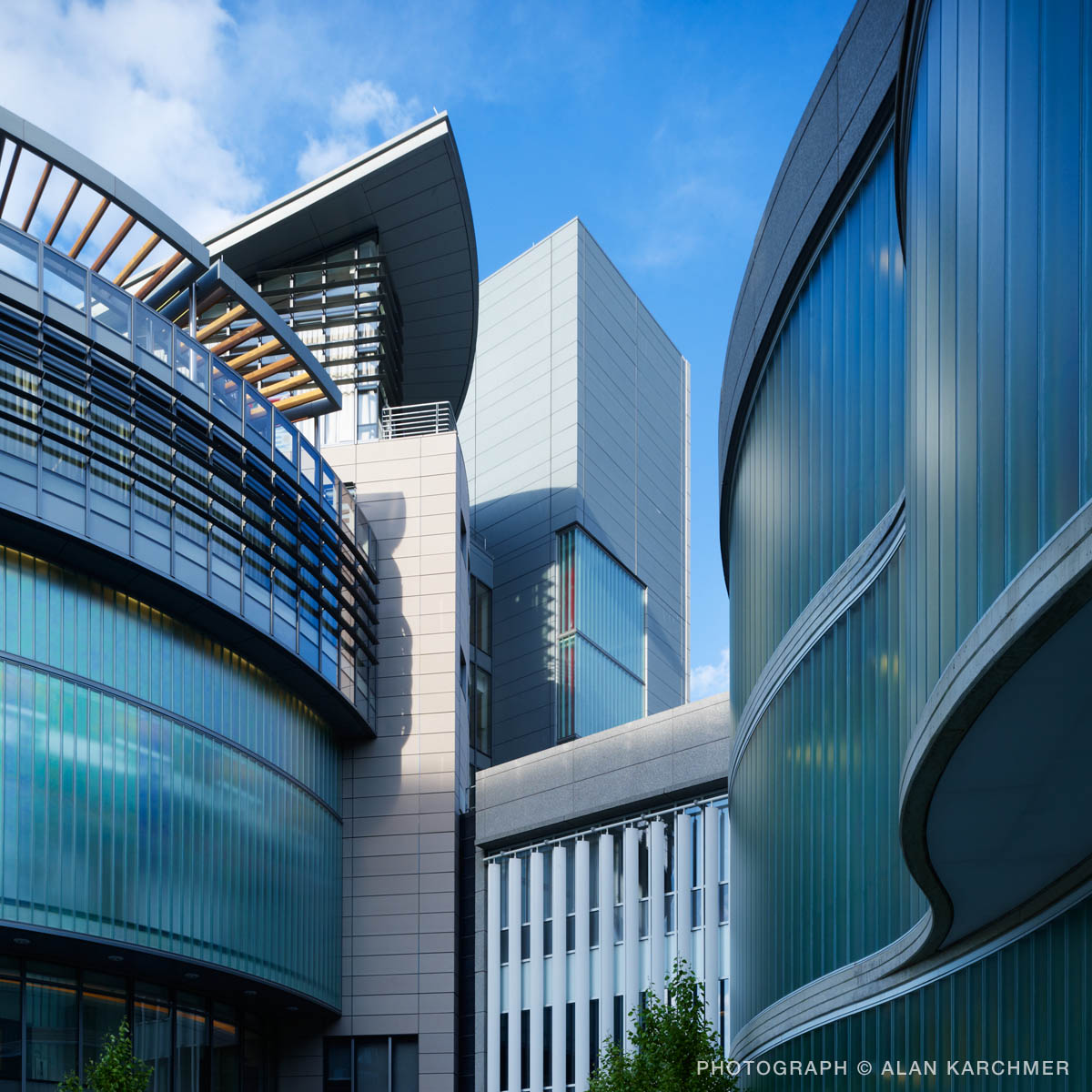
Schick: On the first building we used a lot of precast concrete for environmental purposes. There is also a lot of channel glass which affords much natural light but does not sacrifice privacy for the employees. There are exterior sun control louvers on the south and west facades.

DCMud: We understand the choice of terracotta skews wide.

Goldstein: We used (environmentally friendly) terracotta to define the area where the lab is on the 3rd and 4th floors of building #2. The office area above it on floors 5, 6 and 7 is glass and metal panel. The terracotta also scales the building down because there's a residential area to the north, so we used a color that's similar to brick. It also serves as a rain screen system, where the waterproofing is between the screen and the skin.

Schick: It's done a lot in Europe. There's no caulking, sealing and tightening.You're getting the water not to penetrate the building at all; the rain drips down behind it with its pressure equalized. And architecturally, the design of this building swoops you around to the public space on Cameron Street.

DCMud: What was the thinking behind the extensive use of public spaces?

Goldstein: In CBD's (central business districts), you're allowed to double the FAR (floor area ratio) if you provide a public amenity space in 20 percent of the lot. Our FAR was 'one' on this project, which was extremely low. One means if the property is 40,000 s.f., as with the lab area, then you can only build that much. But if you offer a public amenity space, like the courtyard we created, you can double it, which is what we did.

We created what are called pocket parks. Across the street there is an apartment building with an amenity space also, so they could double their FAR. So when you take their amenity space, and our pocket parks, and then an atrium we've created for Phase III, it becomes one large dynamic green space with a road running through it, which is the goal of the Parks Department.

Schick: There's also a public space that's interior, and it's three stories tall. It's always open, so if there's inclement weather, or you just want to experience that space, you can do it -- including on your way to the Metro which is nearby.

Goldstein: Our client calls the UTC campus 'one of the gateways to Silver Spring.'


DCMud: We understand the connector between two of the buildings has a bit of a backstory.

Schick: That was a hard thing to get approved by the neighbors. They didn't want a bridge because it takes people off the street, but this was purely for the company - and it's really called a connector. It was constructed in the South, trucked up and lifted into place. They had to close the street.

DCMud: Tell us about the final building.

Goldstein: It's an office building for staff. The entry is a 3-story atrium space off of Cameron Street. There's a pocket park off of Spring Street at the west end of the property, which is linked to the Cameron Street entrance through the atrium. The first floor is retail. The second and third floors - open to the atrium - are these 'Google spaces' - open, casual, working on your laptop, playing ping pong, having coffee or juice kinds of spaces. There's a lecture hall here as well.

DCMud: A potent feather in Silver Spring's municipal cap - and yours - to say the least!


Photos courtesy of Alan Karchmer and Anice Hoachlander

Sabtu, 01 Desember 2012

Very Far, Very Fast: Firefly

Q and A with Griz Dwight and James Lafley 
by Beth Herman

Delivering a fully redesigned, rejuvenated restaurant in three weeks' time, architect Griz Dwight of GrizForm Design and Superintendent and Senior Project Manager James Lafley of Potomac Construction Services raced to reopen the outmoded Firefly, 1310 New Hampshire Avenue NW, located inside the Hotel Madera. Frequented by tourists and locals who covet the venue's famed pumpkin hummus, and steamed blue bay mussels, expanding the now 62-seat dining space and adding 8 more bar and lounge seats was at the top of the menu. DCMud spoke with Dwight and Lafley about the project.

DCMud: Why the rush? Where's the fire (fly)?!

Lafley: Firefly is a working restaurant and staff was given three weeks off. There are many regular, local customers, and there were functions like weddings planned, so we had to accomplish a phenomenal feat given the extent of the work.


DCMud: Describe the existing space.

Lafley: The whole space - a back dining room; main dining room; bar; a reception room - was drab and dingy. There was a round, outdated, inadequate bar with worn wood on the back. A wall around the kitchen with a cobblestone-like finish looked like the 1950s, though it had been installed in the '60s. Carpeting was very old.


Dwight: The space already had a woodsy feel and we were limited by time and budget, so rather than come up with a completely new scheme, we wanted to take what was there and amp it up. We took the idea of dining alfresco in the woods as far as we could. There was a tree there before, so we attached a swing for cocktail seating.

DCMud: The kitchen appears to be something out of a storybook.

Dwight: It was made to appear like the outside of a house or cottage. We used recycled brick, windows and shutters. They open up so the chef can pass items through them for happy hour. It feels like the kind of space in which your grandma might be as she calls you in for dinner.

DCMud: What are some of the design challenges you faced?

Dwight: One of the major goals of the renovation was to address some of the problems the restaurant was having. There was a huge sound problem, so a lot of our design intention was focused there.

Lafley: The ceiling was sprayed with an acoustical paint for a quieter environment.

Dwight: Acousti-Coat is a NASA-invented paint with ceramic modules inside the paint to dull sound. We also clad an entire dining room wall with leather-wrapped sound panels. The leather has that warmth and outdoorsy feel and absorbs 100 percent of the sound that hits it. We also took tree flaps - giant slices of naturally fallen trees - and made a dividing screen between the bar and dining room. So the bar can have that happy hour where people get a little bit louder, but the sound isn't going right to the dining room.


DCMud: Can you speak to some of the unusual lighting?

Dwight: We were really limited by ceiling height, but wanted to enhance the idea of tree branches and fireflies. Accordingly we attached bent pipes around the ceiling to imitate branches. Each one ends in a dimmed Edison bulb, which evokes the tail end of a firefly. Between this feature and the (cottage) kitchen, it makes it a very warm space.

DCMud: What are some of the other design elements you incorporated?

Lafley: California wood slabs were installed behind the hostess stand and between the two dining rooms, suspended on rebar, to give you the feeling of being outdoors. The outdated carpeting was replaced with engineered wood flooring that matches Brazilian cherry. Stone Source Trend Q tiles, which are recycled and in this case have a greenish cast, tops the new bar and really dresses it up. Slate flanks the side of the bar and runs around the base of the kitchen "cottage," as well as the entrance foyer. We installed glass walls that open up to the outside. In warm weather, the restaurant can be exposed to the street and patio out front.

DCMud: Sounds as though you beat the clock without sacrificing anything - except maybe some sleep.

Washington D.C. design news